Letter case
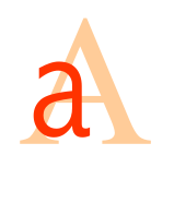
Letter case is the distinction between the letters that are in larger uppercase or capitals (or more formally majuscule) and smaller lowercase (or more formally minuscule) in the written representation of certain languages. The writing systems that distinguish between the upper and lowercase have two parallel sets of letters, with each letter in one set usually having an equivalent in the other set. The two case variants are alternative representations of the same letter: they have the same name and pronunciation and are treated identically when sorting in alphabetical order.
Letter case is generally applied in a mixed-case fashion, with both upper and lowercase letters appearing in a given piece of text for legibility. The choice of case is often prescribed by the grammar of a language or by the conventions of a particular discipline. In orthography, the uppercase is primarily reserved for special purposes, such as the first letter of a sentence or of a proper noun (called capitalisation, or capitalised words), which makes the lowercase the more common variant in regular text.
In some contexts, it is conventional to use one case only, for example, engineering design drawings are typically labelled entirely in uppercase letters, which are easier to distinguish individually than the lowercase when space restrictions require that the lettering be very small. In mathematics, on the other hand, letter case may indicate the relationship between mathematical objects, with uppercase letters often representing “superior” objects (e.g., X could be a mathematical set containing the generic member x).
The terms upper case and lower case may be written as two consecutive words, connected with a hyphen (upper-case and lower-case – particularly if they pre-modify another noun[1]), or as a single word (uppercase and lowercase). These terms originated from the common layouts of the shallow drawers called type cases used to hold the movable type for letterpress printing. Traditionally, the capital letters were stored in a separate shallow tray or "case" that was located above the case that held the small letters.[2][3]
Majuscule (/ˈmædʒəskjuːl/, less commonly /məˈdʒʌskjuːl/), for palaeographers, is technically any script whose letters have very few or very short ascenders and descenders, or none at all (for example, the majuscule scripts used in the Codex Vaticanus Graecus 1209, or the Book of Kells). By virtue of their visual impact, this made the term majuscule an apt descriptor for what much later came to be more commonly referred to as uppercase letters.
Minuscule refers to lower-case letters. The word is often spelled miniscule, by association with the unrelated word miniature and the prefix mini-. This has traditionally been regarded as a spelling mistake (since minuscule is derived from the word minus[4]), but is now so common that some dictionaries tend to accept it as a nonstandard or variant spelling.[5] Miniscule is still less likely, however, to be used in reference to lower-case letters.

.JPG/440px-Adyge_alphabet_1927_(1).JPG)


.jpg/440px-Fountain_pen_writing_(literacy).jpg)